One portrait is a conversation piece. Two or three together is a collection. Four or more is a dynasty wall. Here's how to make each layout work.
The Grid (Clean and Formal)
Same size prints, same frames, arranged in a neat grid. Two across, four in a square, three in a row, doesn't matter. The key is consistent spacing (5-7 cm between frames) and identical framing. This looks intentional and structured, which mirrors the formal classical style of the portraits themselves.
Works best with 2-6 portraits. Beyond that, the grid starts to dominate the wall.
The Salon Hang (Controlled Chaos)
Mix different sizes. Put a big one in the middle, surround it with smaller ones. The arrangement looks asymmetric but follows a hidden logic: align the center points, or keep the bottom edges on the same invisible line.
This is the layout you see in old European galleries, paintings of different sizes filling a wall from floor to ceiling. It feels curated rather than rigid.
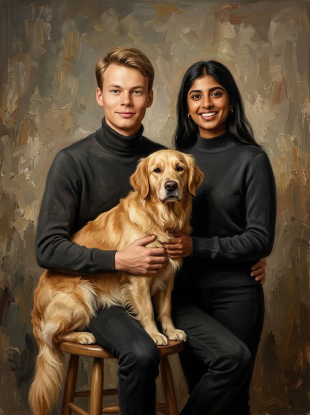
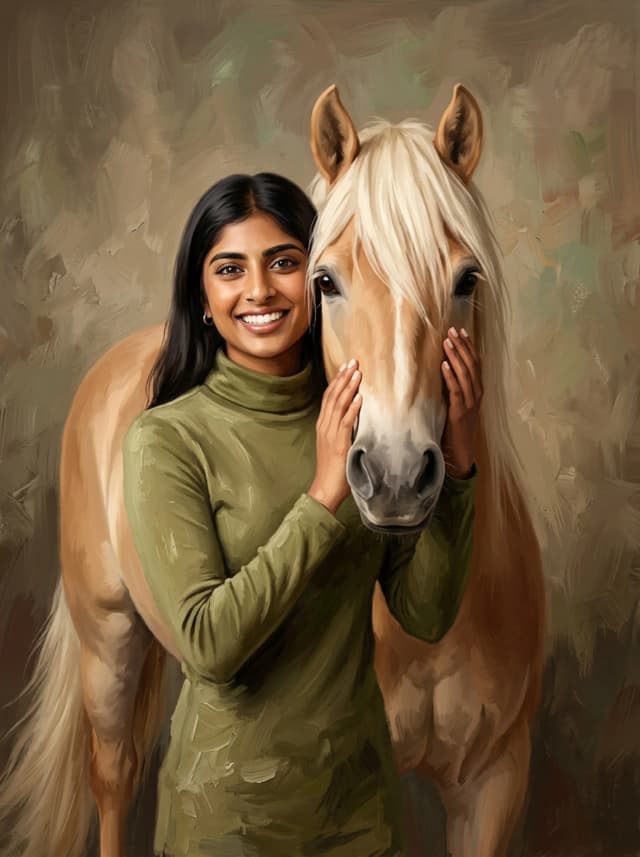
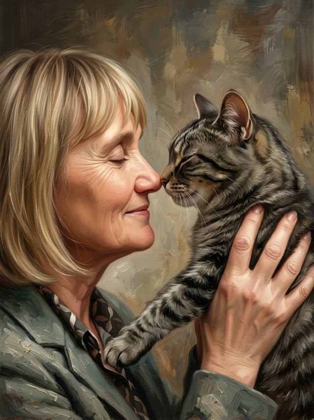
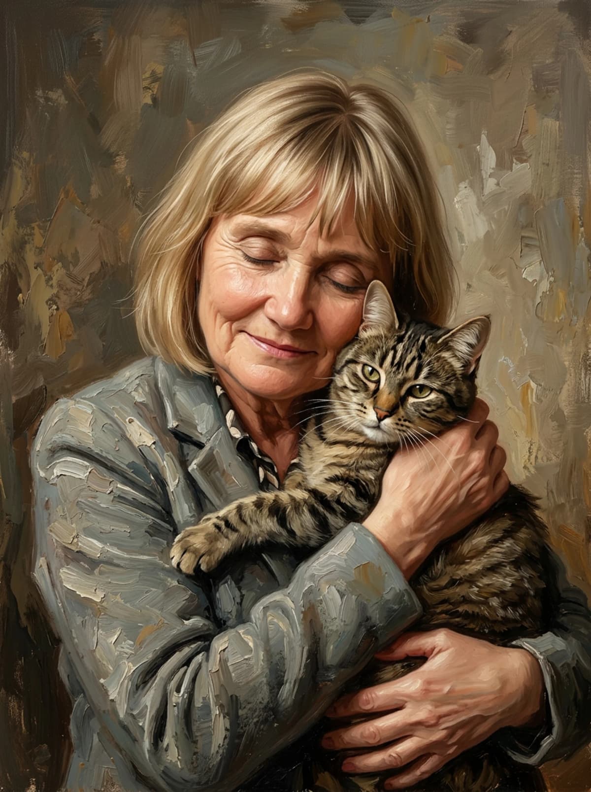
The Dynasty Line
A single horizontal row of same-sized portraits. This is the power move for families with multiple pets. Each pet gets their own portrait, their own frame, their own spotlight. Hung at eye level across a hallway or above a long sofa, it reads like a royal family portrait gallery.
Rules That Apply to All Three
Keep the frame style consistent even if you mix sizes. Measure the spacing between frames, because eyeballing always leads to regret. Keep the collection on one wall unless the room is very large. And make sure there is good light. A gallery wall in a dark corner is a waste.
Start with two. Add over time. The classical style stays consistent, so a portrait you order today will match one from next year.